Your app is your brand on App Store – if you are about to publish your digital magazine on mobile devices, read this article to find out how to prepare a good looking digital magazine design, recommendable content which is read with pleasure and which works on Apple mobile devices with iOS and Android controlled tablets and smartphones.
Your native PressPad app is a virtual kiosk and, at the same time, a reader visible in News Stand which allows readers to look through successive digital issues. A great advantage of such a solution is that you can put every issue in your PressPad publisher panel in a PDF format and subscribers of your magazine will instantly see the successive issues on their tablets or smartphones.
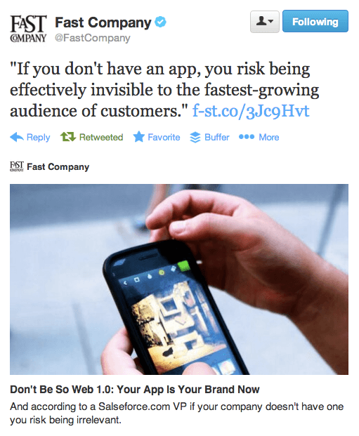
The FastCompany magazine accurately noted in the article “Your App is Your Brand Now” that:
“If you don’t have an app you risk being effectively invisible to the fastest growing audience of customers: more than a billion app users already exist, and that market is growing at nearly 30% every year.”
The Guardian Case Study
The fact that adding digital channels to the magazine distribution strategy gives huge promotion and sales opportunities was already noticed by publishers, both dominating and local. The number of newspapers’ online versions is growing so fast as the number of their smartphones-concentrated consumers. One of the publishers who first noticed and exploited the potential of the new technologies was “The Guardian”. Without a doubt, putting the paper version on the iPad had a considerable impact on the fact that they went from being the ninth-most read newspaper in the U.K. to a global news organization.
Hire Mobile Apps Publishers
Make the first step, take a look at what kind of apps we can build for your publication »
We can debate on their international success based on digital newness, but the key to success was constant development and their striving for perfection in the design of their iPad app which became a great complement to the printed issues. They did more than simply go to mobile platforms – they also adapted the digital magazine design to the new generation of customers expecting high aesthetic experiences.
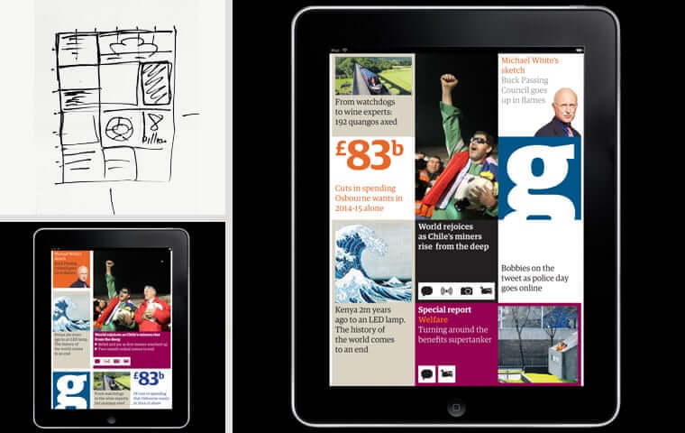
The way they’ve been through to create its iPad app has been analyzed step by step in an excellent presentation that outlines how “The Guardian” newspaper has evolved. This has a lot of good advice for anyone who wants to go mobile.
Where is “The Guardian” magazine app now?
Look at these below-mentioned statements of “The Guardian” app results published in the Google News Initiative (the link opens a source PDF report):
- an average of 2.6m browsers per month and more than 6m over the full year, in which this audience generated over 4 billion page views in 2018
- total premium tier subscriber base increased by 60% in 2018 and their premium acquisition volumes have doubled year on year
- Android app is now ranked the #1 Highest Grossing App in the News & Magazines category on the UK Play Store.
They admit that: “Our approach has been hugely successful.”
Why do I show you this?
Obviously, you don’t have to invest millions of dollars to appear on the mobile platform with your magazine but the case of “The Guardian” is interesting, instructive and inspirational for every publisher.
Adapting to the new technological possibilities and looking for the best version of an online newspaper is a long-term process which is often based on the trial and error method, with varying degrees of success. To avoid this path, we’ve prepared for you a special guide devoted to digital magazine design.
If you want the digital edition of your magazine to be read on mobile devices, to make use of the full potential of those devices, and to make the User Experience the most valuable, stick to the following rules while creating a PDF of your magazine.
Digital Magazine Design Rules
1. Cover design
We shouldn’t judge a book by its cover. In magazines cases, however, quite the opposite.
Online publishing industry has put cover designing on a high level. Brands keep raising the bar for one another. This is not surprising – the cover is the first and the most important illustration in the magazine and this concerns both print and digital versions.
There are two important goals when designing every magazine cover. The first is to attract the readers’ attention and the second is to express the content, theme, and style of the magazine.
So what’s the difference between designing the print covers and the digital ones?
Digital magazine cover should be designed in such a way as to catch people’s eyes regardless of the screen size, to generate clicks and downloads and as a result, trigger sales.
If you decided to move the print cover to the digital screen without any changes, you have to be prepared that some details will be lost on a smaller display. It’s good to start thinking about the cover as one would of a splash page on a mobile app – the multiplicity of elements won’t be a good idea, because of the lack of transparency.
There’s a lot of tips on how to design digital magazine covers. In most cases, they are concerned with avoiding million elements, staying away from busy backgrounds and using interesting photo or illustration. But in the digital era, it might not be enough.
You should go deeper.
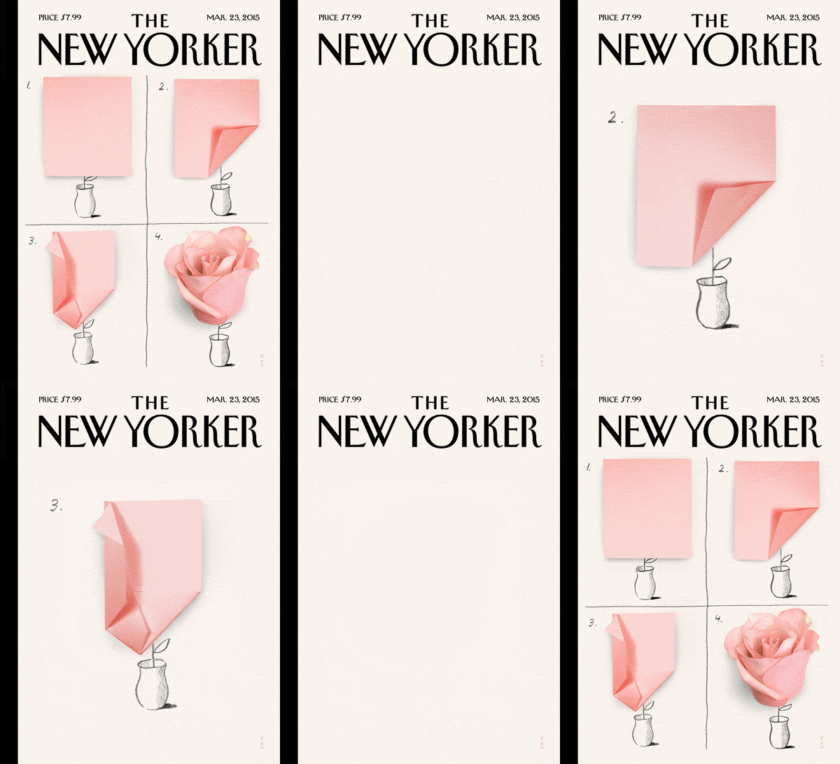
The digital magazine design gives a possibility to use moving images, animations, gifs. There’s no need to bog down an online cover with a lot of text to add interest to the project. You don’t have to stick to rigid rules: big fonts title, minimum amount of subheadings, a photo with a woman staring at you, etc.
That’s not the point.
Today, the magazine cover has become a kind of separate artistic element with its own life. Many readers, seeing a stunning cover on Facebook, Instagram or Twitter will appreciate its own aesthetic value and pass it on to their friends.
Social media gives magazine covers the ability to go viral. Your task is to use technological resources in such a way to achieve lots of positive reactions and shares under posts presenting your cover.
2. Magazine page layout
The variety of devices that readers can use to consume content today, forces publishers to adapt their digital publications to different types of screens: from a huge monitor to the small smartphone. The legibility on all of them should be a priority in magazine page layout designing. This aim can be easily achieved with a touch of knowledge we’ll give you.
Digital technologies deliver a lot of possibilities in the magazine layout design field, which wouldn’t be possible with print publishing. Today, creating an online publication is an exciting process based on disrupting the usual layout conventions, experimenting with new approaches and risking crazy ideas.
Even if technology development has brought a lot of changes around the publishing industry, there are several important constant elements – the digital magazine layout still should be composed of headline, image, image caption, running head, byline, subhead, body copy, etc.
How to put all these elements together to create a layout page that is legible, functional and visually interesting?
Before you dive into the designing process for good, begin with planning the body copy of an article. It will take the majority of space, so set the right margins in terms of columns and rows to maximally improve readability. Remember that you should be consistent with the length of the body copy for all the articles in the magazine.
In order to have a digital magazine design which is legible and good looking, use one or two column layout. Mobile applications on smartphones and tablets allow you to view magazines in portrait or landscape modes. In the case of portrait mode, only one page can be displayed and in the case of landscape mode, two pages can be displayed at the same time. That’s why it is so important that every page keeps the 4:3 ratio.
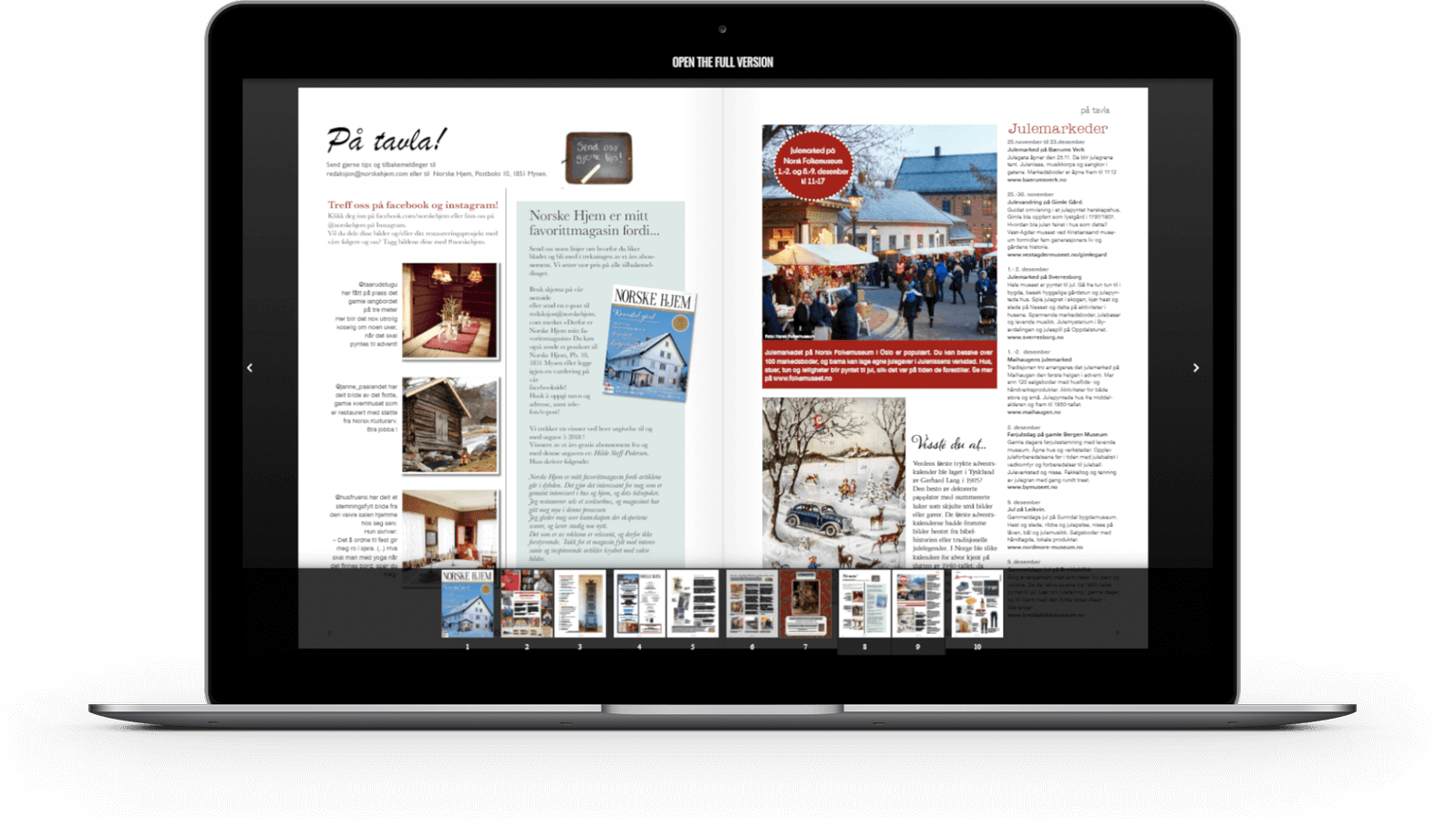
This allows both in vertical and horizontal mode, to use the whole space. What’s more, it creates additional opportunities of building great User Experience because in landscape mode you can get an extra (central) column formed by putting together the two smaller columns on adjacent pages. To select the optimal column width you can use the Golden Ratio principle used successfully in the art of design (also digital magazine design).
The consistent and organized structure of layout design gives even the experienced designers a lot of sleepless nights. One of the easiest ways to control the architecture is to apply a grid system.Imagine a series of lines (vertical or intersecting) that divide a page into columns or modules like in a table.
They are something like a skeleton that allows organizing elements inside the project: text sections, images, decorative elements. They facilitate the decision about where each element should be placed rather than where it could be placed. Grids put order to the whole project and speed up the design process.
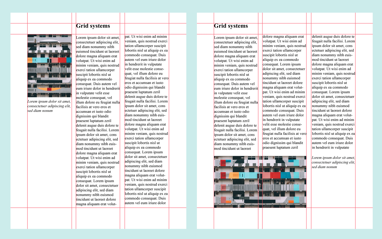
Thanks to the grid system, you can complement the composition with an element that will be a preview of the next articles, combined with interlinks with which you can easily jump to the different location in the magazine. If your magazine or other publication consists of multiple pages, this type of grid can be a nice variation for the reader; it can also serve as the internal menu.
How to optimize grids for mobile magazine design?
- Smartphones’ screens have limited space, so if you want to provide easy reading, making a multicolumn layout isn’t a good idea. Design mobile version of magazine keeping one or two columns.
- Consider using a tile layout grid – the column and row heights will be the same, which will give a look of square, equal tiles across the design.
- Make images large enough to be recognizable but also small enough to put up the content.
If you’re new to digital design, a template is a sensible place to start. Have you seen app themes for magazines created by PressPad?
3. Digital typography design
The use of proper fonts is essential, and typography itself is viewed as secret knowledge. Nothing could be further from the truth. Well-chosen fonts, which create words correctly formatted with spaces, not only make the reading easier but also affect the positive reception of a magazine as a professional one.
Typography has a huge impact not only on readability but also on keeping the reader’s attention, just like the cover. This is all about catching the eye. Moreover, properly selected fonts allow people to focus on the sense of the article instead of the mechanics of reading.
Before choosing fonts, study your audience. Do you know what age they are? What professions they practise? Are they scientists, lawyers or doctors? The reason I’m asking is to choose the kind of fonts which will fit readers’ expectations and their lifestyles. Sounds weird? Comic Sans might be perfect for kids but not lawyers. Use fonts wisely!
Serif vs. Sans-Serif
Is it the truth that Serifs look aspirational and Sans Serifs boring? Which one is easier to read?
Sans Serifs perform better on the web. They are easier to read on computer monitors because they are less visually complex – reading requires less time to be processed and our brains focus more on the message than trying to decipher the characters.
They are more legible in small sizes, because of their simplistic forms. Usage of Serif typefaces on low resolution screens can even cause visual dissonance, retracting the readers from reading the content.
It doesn’t mean that you have to resign from Serif fonts.
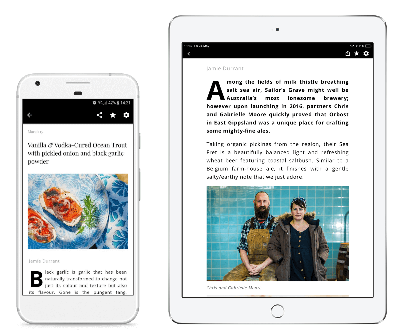
Look at “Essentials Magazine Australia”. They mix both types together keeping the Serifs for the title and San Serifs for the body. It looks great, doesn’t it?
Drop caps
I’d like to present “Essentials Magazine Australia” as a role model once again. Just because they’re doing typography well. This time, it’s about drop caps. Remember a large capital letter used as a decorative element at the beginning of a paragraph or section in old books and manuscripts?
Drop caps are an effective way of grabbing readers’ attention also in the digital magazine design. They add personality and visual strength, giving the magazine page unique look.
Hint: Don’t use drop caps that drop only two lines deep. They aren’t so effective. The wider the column, the deeper drop caps can go.
Butterick’s Practical Typography includes a complete set of techniques of arranging type to make written language legible, readable and appealing when displayed. Here’re the key rules I’ve listed:
Hint: Be aware that pixels (px) are not the same as points (pt), where sizes of fonts are defined. You’ll find the appropriate converter here.
4. Magazine’s interactivity
Even if you decide to put QR codes in your print issues to add fresh value, it would be only a fraction of all extra things you can do thanks to digital publishing. Interactive magazines combine stunning visuals with truly rewarding user experience. Use rich media to make an article even more compelling.
Videos
People love watching online videos and pay more attention to this type of content than any other. Embedding an engaging video, compatible with the rest of the article, is an incentive to continue reading the magazine in digital format. You will be sure that readers stay with your magazine much longer.
Add videos for attracting the attention of readers and to better express your magazine’s style and philosophy.

At the stage of designing a magazine you need to decide which space of a page will be suitable for a video. Some of the publishing platforms allow embedding a video player widget inside the PDF. Some others like PressPad Magz, take advantage of the streaming video. Allowing the internal widget to play the YouTube video inside the magazine just by creating a hyperlink to the chosen online video make your PDF file much much lighter.
How to choose a proper video for the magazine? Match a video to your magazine’s tone, color scheme, typography, and overall feel.
What kind of videos can you embed?
Show something from behind-the-scenes, extra part of an interview, how-to video or just the background sound of a river. You can use other forms to liven up the reading experience like a flash animation.
Hint: Add subtitles to your movies, because people often watch online videos on a tram or in other public places, so they prefer to do it in silence.
Easy navigation
Digital magazine readers expect to easily navigate inside an issue and want to find the information they need as soon as possible. Features like an interactive table of contents and thumbnails with images will make it easier for them to navigate through the magazine and find the content they seek with just a click.
Another important interactivity features are hyperlinks that allow the readers to learn more about the content, or move to other associated articles. Your digital magazine will work better if you use internal links. These are hyperlinks that connect various parts of your magazine, e.g.: skip to the table of contents, go to the next/previous article, recommended for you, etc. Apply links inside texts, images or ads. Simply drag and adjust an outline over the area that you want to be hyperlinked and enter the desired URL.
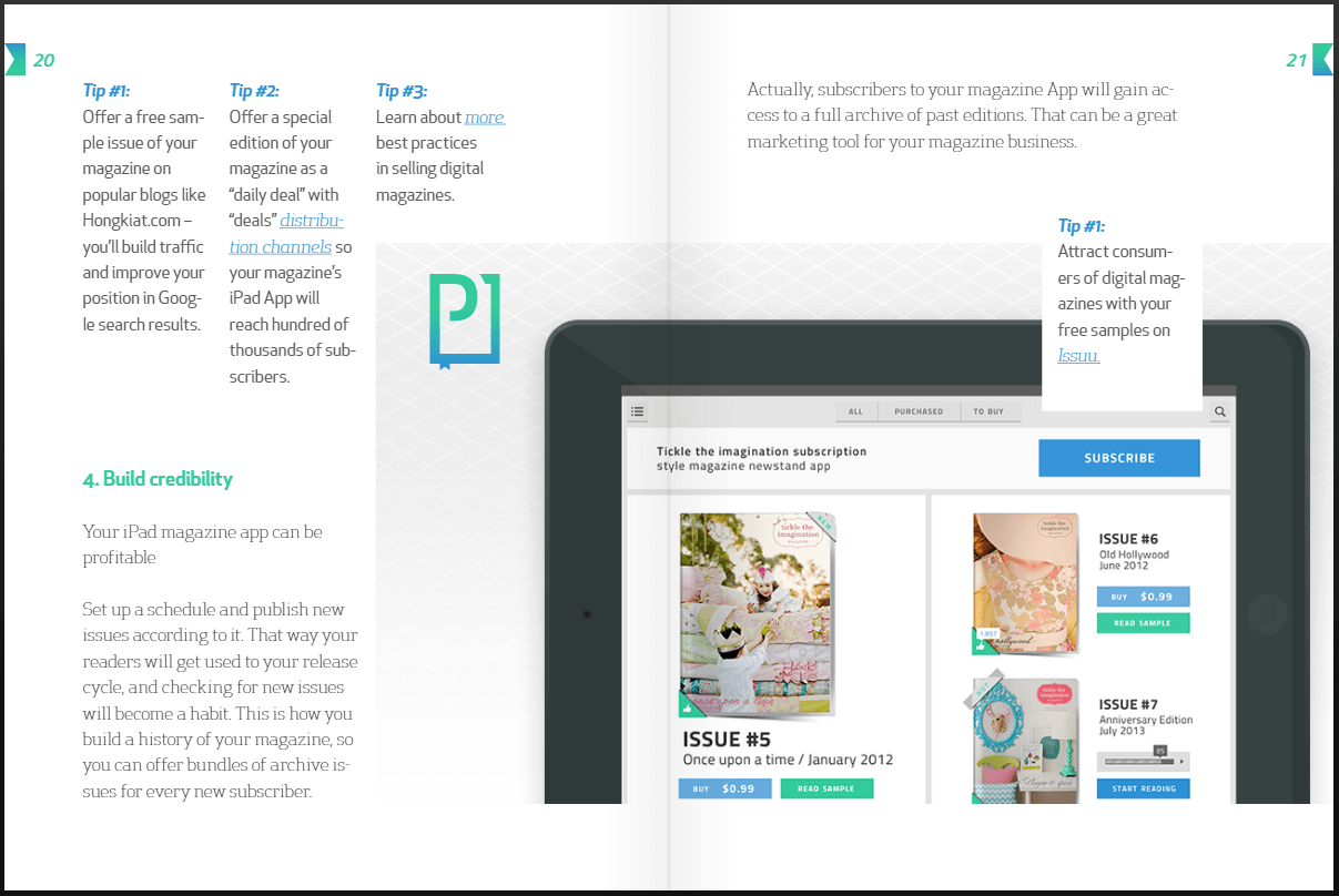
Hint: On the small screen it is easy to click on something just by accident. Remember about the proper size of all elements and the distance between them to make the whole view clear.
By adding videos or links, you can raise the profile of catalogs and brochures. Which format will present the product’s features better: photo or video? How else to move the readers directly to the shop, other than via links?
5. High-Quality PDF
Readers’ preferences about the digital magazine design are quite different: one group wishes a print replica without changing layouts while the other wants to get digital reflows which offer readers a superior reading experience.
We are inclined to follow/support the thesis that the magazine shouldn’t look like a “digital reprint”, nor should the website. People are used to using the internet for free. A mobile magazine is an optimal mix of exclusive content and great user experience served by Apple mobile devices.
What’s more, customers pay for value-added content and unique experience. That’s why you should respect a few rules while exporting your digital magazine design to a PDF file. Any new issue of the magazine must be downloaded by your readers on their tablets or smartphones.
The following measures will ensure that your magazine will provide the same experience on every device:
- Don’t flatten text. It becomes an ordinary bitmap, creating a bigger resulting file. With bigger zooms, individual pixels are noticeable, which is also called the stairs effect.
- Optimize the PDF file in terms of size (not to exceed 50MB). You just have to remember to:
- downsample images above 225ppi to 150ppi,
- remember to avoid inserting thumbs.
- Embed fonts in PDF files. If the PDF reader software (e.g. Adobe Acrobat Reader) cannot find the fonts you used in magazine design, it will use the most matching ones available on a given device, which is not always a good idea.
6. Sales in the App Store and beyond
A user who visits the website of your magazine in App Store is only one step away from making a purchase decision. In PressPad we ensure that every publisher will appear on the product page in App Store without the need to own a developer account and without the need to pay anything to Apple Inc. We take care of everything, so that publishers can focus only on their publishing process.
There are a few factors stimulating sales of digital magazines:
- Ability to subscribe to a magazine.
- Competitive pricing model for a subscription (read about Apple pricing models).
- Magazine preview, which is generated by us but we are open to suggestions of our publishers.
- Free sample of a magazine in the abridged ‘preview’ version.
- Possibility of selling previous issues.
- Cover/logo encouraging to purchase (look at the beginning of the article).
- Increasing sales through offering mobile editions on publisher’s website and/or blog… or any other associated pages.
The same goes for other stores like Google Play, Amazon Appstore, and even your branded digital newsstand that you can embed on the website.
Digital magazine design isn’t set in stone
Working on every part like cover, layout or typography is a flexible and ongoing process. The final results should be tested and, if the need arises, changed to achieve effects satisfying to the readers. If you don’t know what I mean, get back to the beginning of this article and read “The Guardian” story again.
Or, if you have specific needs related to your magazine’s digital distribution contact us for the further consultation.

