In today’s entry on Mobile Publishing 101 I’d like to shed some light on your Newsstand app description and screenshots appearing in App Store.
When you add an application to App Store you fill in lots of information about you and your magazine. First things that your readers will encounter in App Store are: name, description, and screenshots I mentioned before.
We already had a blog entry about your app name, so this time we’ll stick to app description and screenshots.
Description
App description is important for several reasons:
- Firstly, the search queries that the readers looking for your app will enter in the App Store search engine need to be covered by your app description Apart from app name, description and keywords there is no other source for Apple to get the search data. So if you run a magazine about weddings, and the word “weddings” does not appear in any of the above mentioned places, nobody will find your app.
- When users eventually find your app in App Store, you need to convince them to download this particular magazine. All the tricks used in advertising, writing press materials and designing landing pages work here as well. Therefore your app description needs to be substantial, considerably long, and preferably in English (unless you need it in your mother tongue). It’s wise to use keywords related to your magazine – the more, the better. However you need to keep some balance; it’s best to use each keyword at least once.
Screenshots
Recently Apple made two significant changes regarding screenshots. First novelty is better exposure of the screenshots in the App Store. Now the screenshots are the first thing for users to see while browsing your app page. Previously the screenshots were displayed beneath the description and now they’re above it.
Second change concerns the possibility of uploading new screenshots. Not so long ago it was possible to change your app screenshots anytime. Now the rules are stricter, and you can’t change or upload new screenshots unless you’re updating your app. It’s important to remember this and choose the screenshots wisely. Changing them later may not be that easy.
There are two interesting tendencies of screenshots designs:
- Your magazine covers – Apple allows you to upload up to 5 photos for each app, therefore the publishers often choose five best covers of their magazine.
- App Store comix – an interesting idea which has been quite popular for some time now. In our opinion it deserves all the recognition.

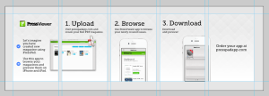
It works like this: you prepare a five-element story with photos (magazine covers in this case) and text information. We use this idea for PressViewer, our preview app
Final thoughts
Your app page is the first thing that your readers encounter, therefore you should think about spending a considerable amount of time designing it, because it’s best to start with a positive impression.

