Attracting readers to your magazine is both a science and art because of mobile technology influence readers’ behavior. That’s a challenge for the publishing industry.
Modern readers are digitally-flexible – they are adapting well to new, varied sources of getting information, and they are absorbing technological novelties with ease. These factors made linear decision-making consumer’s journey obsolete.
Publishers don’t have an easy life, do they?
The key to making it easier lies in the answer to the following question: how are the publishing process and reading habits evolving as a result of the technological change; and what opportunities this knowledge opens to the publisher?
The current state of the publishing industry can be best described in two words: continued evolution.
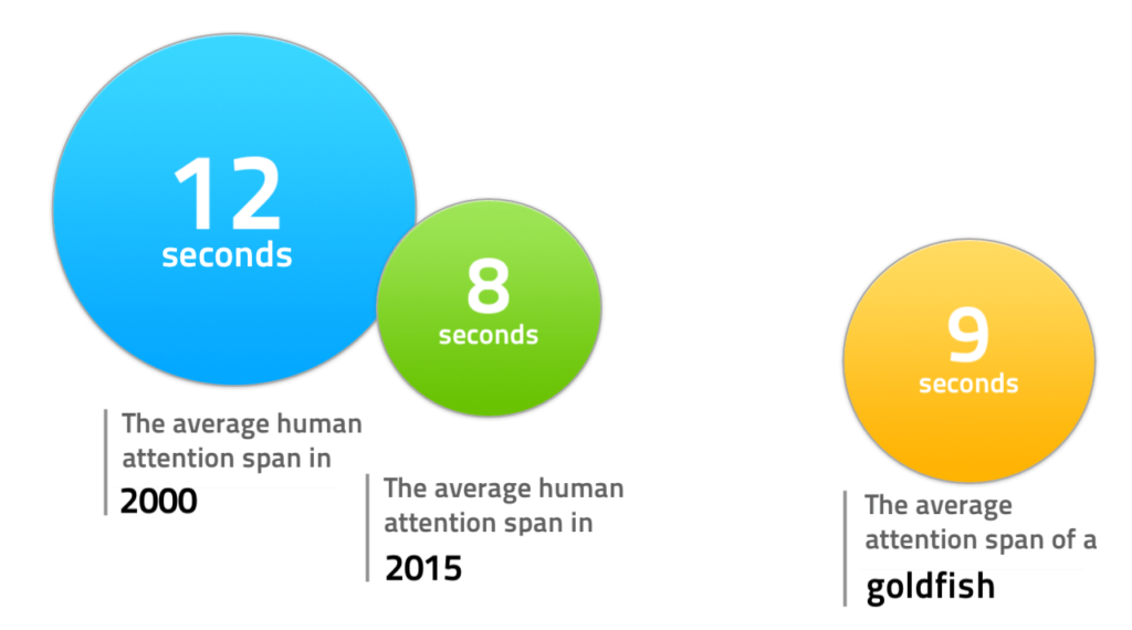
With the ongoing technological changes, the publishers face decreasing readers’ attention span, so creating mobile-optimized content, and sales funnels is a must.
Sounds interesting? Let’s get started.
Technology companies have taken the publishers-readers relationship by storm, deconstructing an existing supply chain and forcing changes in the distributing, consuming, promoting and monetizing field.
Digital newspapers and websites have experienced growing popularity in recent years – in 2017 around 44 percent of U.S. consumers cited some sort of online publication as their main source of news. Social media platforms greatly contribute to this increasing tendency.

Ofcom (The Office of Communications in the UK) conducted the study to know and understand attitudes and behaviors related to online news consumption.
What the research has found is that:
- the primary device to get online news is a smartphone,
- the primary platform to reach most of the news are social media channels,
- the primary mindset to approach news is passive.
These findings have huge implications for how news consumption is understood, and mark the path to effective content creation and distribution.
Content scrollers – how to hold their attention?
Content delivered mostly via smartphones supports passive news consumption, i.e. encourages scrolling, swiping and watching behaviors rather than proactive searching and exploration. People scroll down their newsfeeds really fast, trying to find something interesting that catches their attention. When they succeed, they click, open the article and… leave quickly. Around 55% of visitors keep reading the article which they clicked in for only 15 seconds or less. It turns out that digital content seekers get bored fast, or maybe the headline was confusing, or they clicked it just by accident.
Let’s think: is traffic still an appropriate measure of publishing content success now?
In today’s over-saturated digital world, the publishers should double their effort in the field of holding readers’ attention. From the analytical point of view, it means measuring time spent on site, not the number of clicks. By understanding how digital readers’ attention works, the publishers can create better experiences that will help them complete their goals.
As Alfred Hitchcock once said: “A good film should start with an earthquake and be followed by rising tension.”
Just like a good article.
An online article encouraging to stay
What makes us click on this particular article and not some other when we have thousands to choose from?
“Great headline” – you can say. That’s true, but it’s just the first step to success. Every strong headline must be followed by an addictive continuation equipped with three components:
- practical utility,
- interesting content,
- surprising facts.
People won’t leave an article if they find what they were looking for. Moreover, they expect the knowledge inside to be compatible with the headline.
In the digital space, more things are competing for your readers’ attention than ever before. People are more selective about what they will spend time reading.
How to encourage readers to click and make them stay around a little longer?
- Write the headline after finish the article – only then can you tailor it perfectly to your publication.
- Prepare a few proposals of the headline, consult with someone or think about them for some time. Choose the best one.
- Before publishing, ask yourself “would I click on it”?
Technology presents more multitasking opportunities when people are reading. The modern reader is easily distracted so he expects from the article to find the key point quickly, after that he can leave and return to work. Transparent pages with a clear value proposition are able to hold people’s attention for much longer.
Hint: To accurately navigate long-form content visitors, use subheads and bullets.
People often have the tendency not to read the entire the article carefully from the first word to the last – they prefer to scan the publication and hold on to the part which interested them the most.
However, people can be motivated to scan longer parts of texts, if pages have discernible, descriptive headings and content divided into obvious chunks. Regardless of the type of device people read on, they expect easy navigation to avoid wasting time in order to find what they’re looking for.
With a rising consumption content on mobiles, it is necessary to have a responsive website design. When consumers visit the web on their smartphones, they do not have time to wait for loading or manually adjusting the size of the screen to fit the mobile device they are staying on. RWD will make the site mobile-friendly, improve the way it looks on devices with different size screens, and increase the amount of time that visitors spend inside.
Snapping by mobile app
While responsive website design lets new visitors experience your website in a proper manner on the go, the mobile app attracts the returning ones. This tool has the ability to stimulate loyalty by building and pulling its users deeper into the conversion funnel. It will help you keep in touch with every reader, engage your community in every place and at any time.
Mobile apps notify people about new content and the latest news, which makes it impossible for them to forget about the brand. Even if they can’t read at that moment, they can save the article and come back to it when they have time to stay longer. These reader-oriented features allow them to be constantly up to date and decide when to read, even if they are offline.
The fact is that the design of user interfaces on smartphones favors feeds of content and video formats and helps to keep respondents in-app. People watch short mobile videos when they have a free moment: in public transport, crowded places, queues etc., so they prefer to do it without sound. If you decide to use the video format – include subtitles.

Mobile apps allow publishers to monitor their visitors’ activity: they can measure when and how long the app is used, why and where people tend to drop it, what kind of news they like, if they give up after they hit a paywall, etc. By answering these questions and improving some of those issues, you can boost the time spent in the in-app content. This approach, based on analytical research, can enormously increase the readers’ appetite for the news.
Mobile-friendly newsletter
You’ve got around 15 seconds, remember? If nothing attracts the visitor’s attention on, they will run away from your website.
One, two, three… Poof! You’ve just lost a potential customer.
Let’s start over.
What if I tell you that 15 seconds is enough to start a long-term relationship?
Hint: Put a simple, non-aggressive, non-invasive pop-up on the bottom of the website, informing about getting a free bonus after entering an e-mail address or, for example, announce a newsletter with tips, articles; in short: the value that will be of interest to the visitors.
People who are interested in special value materials that you propose will share their e-mails with you to get it. Now it’s your turn – you can build a base of addresses of those people who have already entered your page. By sending free bonuses and giving value, you establish a line of trust between you and the visitor, and that is the most important value in the digital world.
81% of people use a smartphone for checking e-mails on a regular basis.
What many entrepreneurs forget about is that your newsletter has to be mobile-friendly. The main rule is simplicity and transparency. In this case, less means more.
Getting a newsletter on a smartphone is not a hassle, provided that it can be read by scrolling down, not by pinching and dragging the text. A single-column format makes the newsletter easy to read on tablets and smartphones.
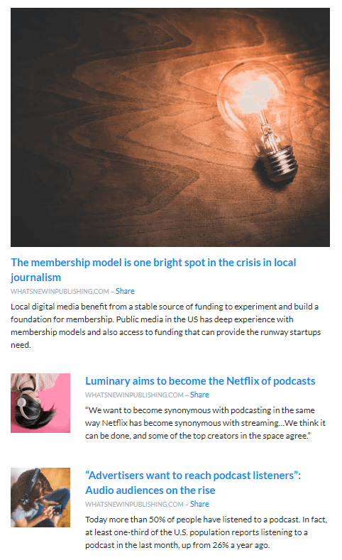
Look at the “What’s New in Publishing” weekly newsletter – nice-looking and easy to navigate design which allows subscribers to choose easily what are interested in. Did you notice smart CTA – “share”? It makes people can send an article to their friends before they read it.

What else favors mobile newsletter?
- Short paragraphs are easy to follow because they tend to focus on one point, rendering them especially appealing for those who read on a mobile device.
- One good photo instead of the excess of pictures to pull readers in, and stop there. Many images take time to download and if it is taking too long, the readers will simply resign.
- Enlarge links or keep them far away from each other. Given the size of the screen of a mobile device, and the size of the human thumb, it is very easy to click on the wrong link if they are too close together.
- Place the unsubscribe button away from all other buttons. You don’t want the unsubscribe button anywhere near another button where it could be clicked by mistake.
- Short articles connected (e.g. via hyperlinks) with target content: your responsive website or mobile app.
It comes naturally: people who are getting some valuable statistics, reports, and information in a comfortable format, stay with your brand and begin to trust you.
Where does it lead?
Digital content consumer journey
The consequence of new technologies appearing in the publisher-reader relationship is the fact that the customer’s journey is not linear and does not lead from point A to point B. Consumers have more options to get and buy content available in both the physical and the digital world. To make a final purchase decision, they need many encounters with a brand.
Today, the building of the sales funnel should resemble an e-commerce model because the publishers are de facto selling a product.
At every convenient moment on the path of exploring their brand, the customers’ attention should be grabbed by such content which will finally lead to monetizing with different channels.
Let’s get back to the moment when your pop-up caught the e-mail addresses, and you created the client base to which you target your newsletter. In your e-mails do not be a seller – just provide the information your viewers need to make informed decisions about buying from you on their own.
To extend the customer touchpoints, you can use ads. Similarly to pop-ups, they can offer free content: e-books, guides etc. You can probably guess what the next step will be:
the user clicks → lands on your website → types in the e-mail address → gets valuable content

Thanks to this path you’ve got the user’s email and… a pixel thanks to which you can drive ads through to customers or to lookalike audience.
Weekly or monthly newsletters are effective at the decision-making step because they ensure communication with an audience that already has a certain level of confidence.
Hint: Having a user in the database, you can periodically upsell new products; the users themselves can become products because another company may want to sell something to them, and you have the necessary access etc.
The next mailing list, created after a purchase is made or a subscription taken out, gives you the opportunity to stay in touch with people who have triggered action. You can send announcements, discounts surveys, and news. These customers have come a long way to be with you here and now – wouldn’t it be a shame to leave them?
Publishing and technology strong connection
The technological innovations have been accompanied by the publishing industry since the beginning of printing – what can you call the invention of a movable type printing press other than a “technological revolution”? The difference is that today we rather talk about permanent evolution.
The usage of mobile devices is widening, and that changes the way people consume content: they scroll through a lot of information, read selectively and their attention span is short. They are permanently inside a choice moment between a high number of brands, articles, magazines, devices. Ahead of digital publishers stands a challenge to create mobile-friendly content in a way that brings the readers in for a long time, and also to meet with them on the different points of the customer’s journey.
I’m sure that new technologies will impact the publishing industry as long as people want to read. Let’s hope it will last forever.

