While the magazine cover is like the house door inviting you to come inside, the layout of a magazine is like the interior that makes you want to stay inside.
Do you know the rule of cleaning the house saying that there are three types of things you need to keep: useful, pretty, and those you have an emotional bond with? It is similar to magazines. People buy and read regularly only those publications which are useful, pretty, and have emotional meaning for them.
Each of these three issues – utility, prettiness, emotions – is the responsibility of a different team of people preparing magazines: writers, designers, and marketers. Only their cooperation can lead to success. In this article, we take a look at one of the components of prettiness success – the layout of a magazine.
Why do we focus on this particular part?
As old birds in the publishing business, we think that a layout of a magazine is much more important than everybody thinks.
What is a magazine layout?
It seems to be obvious – the layout of a magazine is just the way designers mix pictures and words – and we could leave it at this point. However, when we continue to reflect on composing these main parts of a magazine (pictures and words), we find out that… it is not as simple as it might seem.
First of all, a layout consists of many more elements. When we talk only about words and pictures, we simplify the complicated design process. Secondly, the combination of these components is carefully planned and thought out with no place for randomness. Thirdly, it is a real art to find the right balance between all the pieces.
To sum up, a layout is not only a harmonious relationship between text, images, and white space.
It’s more like a shell of a magazine; the frame on which designers, writers, and advertisers build the rest; the systematic arrangement of elements on every page; template, and pattern consistent for the entire publication line.
The layout of a magazine consists of given elements repeated in all subsequent issues of a given magazine or in the magazine’s thematic sections. Examples of such elements are:
- headline,
- introductory paragraph,
- margins,
- typography (typeface, spacing),
- paragraphs structure,
- indentation,
- color scheme,
- graphic elements,
- initials,
- footers and headers,
- sidebars,
- thickness and color of the frame containing the photo or text.
What we tentatively called “mixing pictures and words” is actually a making series of decisions that include issues like:
- the number and size of columns,
- placement of intentional whitespace,
- size, position, and number of images and figures,
- size of page margins,
- special effects like overlaying text on an image or rich media,
- chapter or section titles, or headlines and subheads,
- image captions.
It should be emphasized that every point from the above lists refers equally both to digital and print magazines.
The publishing business has evolved, screens replaced paper, and the substantial world turned into a virtual one. However, there are things that didn’t change, and basic print design rules are universal and used by digital designers these days.
Online publications took over many layout elements from print – they have titles, headlines, images, captions, subheadings, etc. They are connected in specific proportions. Besides, elements like catchy headlines, succinct subtitles, and attractive photos are more valuable now than ever before due to enormous competition in the digital world.
The same happens with magazine layouts.
How important element is a layout of a magazine?
The layout is extremely important from a practical point of view. It enables the readers to easily orientate in large amounts of information contained in the publication by finding constant, characteristic elements. The main feature here is consistency. But if practicalness were the only layout function, every magazine would look the same.
The layout imposes a unique character on the publication and distinguishes it from the others, as well as makes people dive into the next pages with curiosity.
Of course, you can say that the content is the most important element of any magazine. And we will agree with it, as long as we consider the written word + design as the content. Only this connection makes the magazine complete, like two halves of the same apple.
To better understand the importance and the role of design, please watch this six minutes inspiring speech given by Jacek Utko, a newspaper designer.
What do we learn from this video about design? Let’s summarize:
Design is:
- a signature.
- a channel to talk to the readers.
- responsible for readers’ experience.
- a part of improving the product completely.
According to Jacek Utko, design should be treated as the whole, one piece, one composition like music and designers should be open to experimenting with type, illustrations, photos because they are responsible for the readers’ experience.
There is also a psychological aspect of the influence of design. Although we could write a novel about the combination of psychology and art, let’s focus only on what Gestalt psychology brought to design and art.
Gestalt psychology is a school of thought that emerged in the early twentieth century in Austria and Germany as a theory of perception. Gestalt means “unified whole” in German.
The group of psychologists formulated some rules called Gestalt principles defining how the human mind perceives and organizes visual information. Psychologists claimed that human perception is not just about seeing what is actually present in the world around us, it is also influenced by our motivations and expectations. According to this, the mind “informs” what the eye sees by perceiving a series of individual elements as a whole.
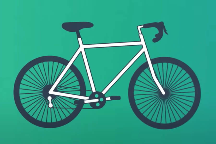
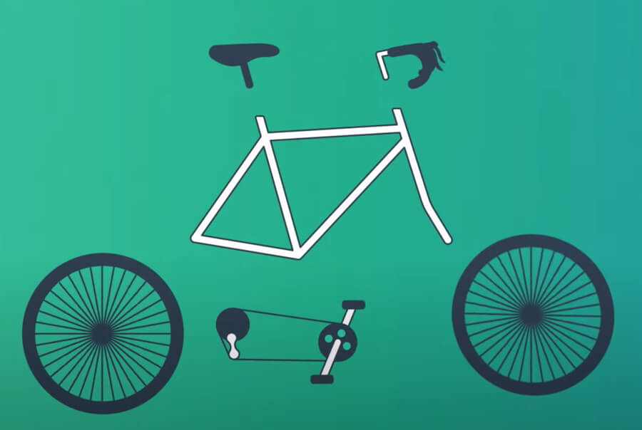
Look at the below picture. What do you see?

We guess your answer was a bicycle, right?
Or… did you see handlebars, pedals, spokes, tires?

That’s the point, the main idea of Gestalt design psychology is we see the whole rather than individual parts. Reading a magazine readers see it as a whole, finished product, not as single pages, separate photos, or paragraphs.
Layout of a magazine glues all the publication’s individual elements together making a coherent whole.
According to Gestalt psychologists, there are six principles of design:
- figure-ground
- similarity
- proximity
- closure
- continuity
- order
Hubspot prepared a great short video explaining all of the above rules. It’s definitely worth watching!
In the video, you saw easy logo-based examples. Gestalt rules are used in magazine layout design too! They help with organizing content on magazine pages to make them aesthetic and easy to understand.
So, how do the Gestalt rules apply to magazine layout design?
- Figure-ground. This rule helps to properly focus the readers’ attention and determines what is key on a given page. The goal is to divide the viewer’s attention into a strategic figure and a minor background. The perception of an object can be controlled by appropriately selected colors, contrast, and sharpness.
- Similarity. It makes readers aware that certain elements work the same way (e.g. every hyperlink in the text has the same font color and is underlined; headers usually use the same font size or color for every magazine issue). As a result, readers quickly recognize the meaning of certain elements. The most important here is consistency.
- Proximity. This rule applies to the formatting of blocks of text on the page. If they are far enough apart, they will be perceived as disconnected paragraphs, constituting a separate whole. This effect is also achieved by arranging elements into a specific shape, as this allows you to group related elements together.
- Closure. It is the most frequently used procedure when designing logos, icons, or the visual project of magazine titles. Thanks to it, they do not have to be detailed or literal, and still remain understandable.
- Continuity. It allows you to direct the readers’ attention to key information or place on the page by guiding their eyesight, e.g. to the next stages of the purchasing process or filling out a form. Objects placed close to each other make the eyes “jump” from one to the other.
- Order. If the page layout is not designed harmoniously, a reader simply wastes time trying to understand it, instead of focusing on the written content, ads, or offered functionalities.
What else makes a magazine layout good?
Well, the better a magazine is designed, the more people want to read it.
Layout of the magazine should fulfill two roles:
- make readers impressed at the very first glance and engage them to start reading
- motivate readers to go through the whole publication with pleasure.
How to achieve such an effect?
- There’s no such important thing in magazine design as readability. The whole written text should be easy to read, so take care of point size, font, and colors.
- Watch out for a contrast between the copy and the background as well as the neighborhood of text and pictures. The rule of balance is crucial here. Putting too many elements on one page be overwhelming. Simultaneously, keeping too many white spaces is also not a great idea.
- When choosing these elements think about hierarchy. What information is the most important for a viewer and deserves priority?
- Last but not least, all your work always should have a purpose strictly related to the magazine character. Think what’s the main goal of the magazine layout. Is it an image-based cook publication? Story-based journal or funny stories? Everything has a meaning here.
What can positively influence the perception of your layout?
First of all, you need to look at your brand as a whole. The most important is to be consistent in creating the magazine line. Layout applies to every number of the title, not to a single issue. This consistency leads to recognition and then to loyalty.
Using large images will be helpful, even if it’s not photography, fashion, food, or travel magazine. According to Hubspot:
- 90% of information transmitted to the brain is visual, and visuals are processed 60,000 times faster in the brain than text.
- 40% of people will respond better to visual information than plain text.
Remember that digital magazines open possibilities involving your audience much more than print: quizzes, polls, embedded videos, and animations. Studies show that interactive content helps enhance conversions by 40-50% as well as increase shareability, which can increase as much as 28%.
Digital magazine typography is also an important element of layout design. The main rule says Sans Serif fonts perform better on the screen because they are less visually complex and require less time for our brains to be processed. However, Serif fonts are more engaging and visually appealing. It creates readers’ interest in the page, so they are a good choice for shorter parts of the text. The combination of both types in the right proportions seems to be the best solution.
Layout of magazines – real examples
Let’s take a look and analyze a few examples of layouts of well-known brands. What do they concentrate on in their designs?
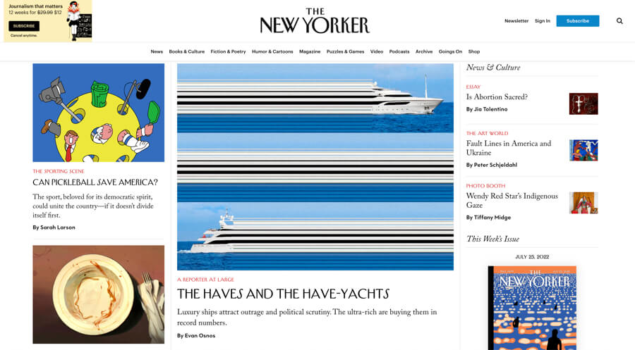
Fans of the paper version of The New Yorker shouldn’t have been disappointed in the layout of the online version. The primary focus is placed on the content, and the layout style is minimalist and appealing. A great choice for a news magazine!

Overall impression: Order, cleanliness, and ease of navigation. Zero chaos. This effect is achieved mainly thanks to the white background. Despite the many articles shown on the homepage, we can easily navigate them thanks to the classic arrangement.
Colors, visuals, and graphics: For both the main page and the tabs, a white background is used, which promotes readability and order. There is actually no play with colors here. Each article has a main cover photo and they are responsible for bringing the color to the whole, as well as photos inside the articles.
Typography: The New Yorker’s typography is consistently maintained throughout the whole site. The article categories are displayed in red, which makes them particularly visible on a white background. The Serif typeface is classic and ensures the text is easy for the readers’ eyes.
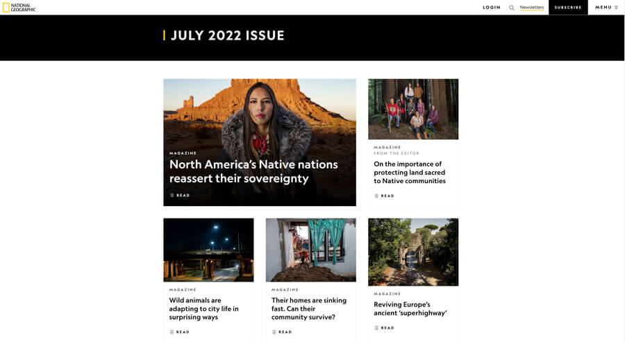
The second example is even more “simple” than the previous one. The magazine is characterized by a simplistic design, and it showcases large images together with an easy-to-read selection of fonts. It’s called the power of the “less is more” design approach.

Overall impression: The content is pulled to the center of the page, with nothing to distract from the right and left sides. This is where our eyesight goes in the first place. It’s a great example proving that white space is nothing wrong. Everything is organized in a hierarchy – the main article takes the most space. The others are next to or below.
Colors, visuals, and graphics: They pay extra attention to the photography aspect. Besides the quality and magnitude, the visuals tie well with the content that they have and manage to give readers a sense of something. Their pictures are worth a thousand words and always tell their own story.
Typography: There isn’t any fancy typography, however, the white title on a black background at the top of the main website catches the reader’s eye. Two colors dominate the whole layout – white and black – with a touch of yellow.
This project shows that a lot of different colors do not mean chaos or overwhelming, but rather a coherent, nice whole that you want to “eat”. This layout won’t be a good choice for a news magazine, but it’s the bull’s eye in food publications. Yummy!

Overall impression: The dominance of colors that make up a coherent, matching whole. This project shows that there is nothing wrong with using a colored background, especially if it is filled with soft pastel tones.
Colors, visuals, and graphics: Lots of warm colors (with an orange and celadon domination), and lots of tempting pictures. A first look is enough to know how important the role of the graphic side is here!
Typography: Font color is always different and fitted to the background. They use a few different fonts depending on the usage – magazine title, the title of articles, category, the body of the article, and play with Sans Serif and Serif fonts.
“Give power to designers”
While print publications provide only text, photographs, and graphics, online magazines can be a connection of three different media: newspaper, television, and radio. It can incorporate new combinations of text and photographs with multimedia elements such as audio clips, video clips, and animated graphics. News stories can now be presented in many different forms so as to provide a different and enriching experience for the users.
Digital magazine layouts have to cope with all of this to engage readers from the beginning to the end without being overwhelmed.
As Jacek Utko said at the end of his speech: “give power to designers”.
There is nothing else but to agree with it, because design in today’s world overloaded with information is the only way to distinguish ourselves, attract the reader and make him stay longer.

