In this article, I’m going to tell you how to speed up the app publishing process, and how to maximize the App Store platform.
Christmas is coming, a rush time for everyone. Many new publishers want to minimize the time to market their magazine in order to take part in the Christmas-New Year shopping tradition. In one of the previous articles, Paul described what happens when you order a free iPad app with PressPad. So, when all the information from the publisher is sent to us, we proceed to building their application for iPad and iPhone.
However, it sometimes happens that the period of waiting for the complete set of information from the publisher extends and thus, we can’t finish all the stages of adding the application to App Store. To speed up the addition of your publication to App Store, send us the information required for describing your application in iTunes properly.

- Name of your magazine application (if different than specified in the panel)
- Keywords (invisible when browsing iTunes)
- Description of the publication (if different that specified in the panel)
- Preview of the magazine’s pages
- Categories of the publication
- Title image of your magazine’s page in iTunes
If you provide all of the above data together with the application order, we’ll be able to take care of preparing your application right away, which might find its way to Apple even on that same day.
Optimize your iTunes presence
App Store optimization
The way you describe your application in App Store directly influences the search results in App Store as well as the application’s download count from iTunes.
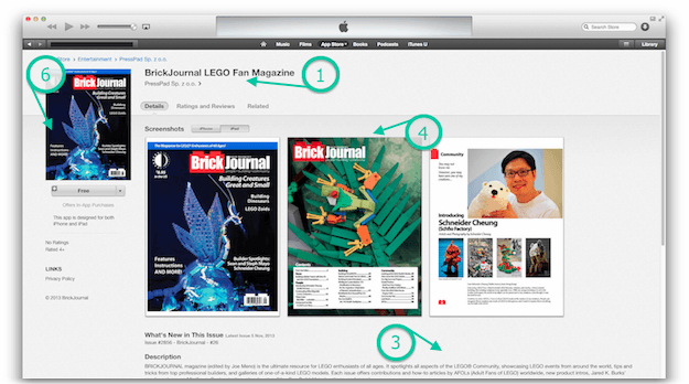
Name of Your Magazine App
The name is very important because according to our research, it has influence on your magazine’s popularity in App Store. In order for the name to do its job properly, it needs to sound naturally (e.g. Australian Street Cars) or consist of two parts: 1) the name itself and the 2) description section (e.g. “BrickJournal LEGO Fan Magazine”). The name “Brick Journal” alone doesn’t say anything and can even be misleading, while the second part of the name: “LEGO Fan Magazine” arouses all fans of Lego construction).
Tip: The application’s name is also highly important in searching App Store because the words that make the name are treated as keywords of highest significance.
Keywords
Keywords are invisible to the person browsing App Store, however together with the application’s name they form a key phrase basing on which App Store’s search engine algorithms choose the best-matching apps for the specific query.
Tip: Don’t repeat words from the application’s name in keywords because the name itself is already treated as a key phrase. Enter a few keywords that best describe your publication in order to maximize search results.
Publication’s description
This text is visible on the App Store page as well as in iTunes. Therefore, each person that stumbles across your magazine can familiarize themselves with its content. And for that reason, it should be as attractive to your readers as possible. The description of the magazine application should provide factual information about what the magazine is, what it offers and what benefits can be gained after downloading the application.
E.g. “(…) the ultimate resource for LEGO enthusiasts of all ages. It spotlights all aspects of the LEGO® Community, showcasing LEGO events from around the world, tips and tricks from top professional builders, and galleries of one-of-a-kind LEGO models(…)”
Tip: Only the first few dozen words are visible, the rest of the description is collapsed. The person seeing you magazine’s description is literally one click away from downloading the application and that’s why the first two sentences of the description should sell it.
Preview of the magazine’s pages
Together with the magazine’s description, preview images are the most attractive visual element of the App Store page. Screenshots sell in the same way as the Newsstand applications’ covers do. You can add from 1 to 5 images that should encourage downloading the magazine. It can be specific content (e.g. information about an exclusive interview in each issue) or rich illustrations.
Tip: It’s best to prepare images (screenshots of the magazine’s PDF pages are ok) in three resolutions: 640×960, 640×1136 and 1536×2048 px. The faster we receive all of the data the faster we’ll send the whole app for review in App Store.
Categories of the publication
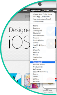
Each magazine enclosed in an app must be assigned to a proper category in App Store. Select a primary and secondary category and Newsstand subcategory that best match your publication.

App Store category list (primary and secondary):
- Book (iOS only)
- Business
- Catalogs (iOS only)
- Education
- Entertainment
- Finance
- Food & Drink (iOS only)
- Games
- Health & Fitness
- Lifestyle
- Medical
- Music
- Navigation (iOS only)
- News
- Newsstand (secondary category only)
- Photo & Video
- Productivity
- Reference
- Social Networking
- Sports
- Travel
- Utilities
- Weather
Subcategory list (Newsstand):
- Arts & Photography
- Automotive
- Brides & Weddings
- Business & Investing
- Children’s Magazines
- Computing & Internet
- Cooking, Food & Drink
- Crafts & Hobbies
- Electronics & Audio
- Entertainment
- Professional & Trade
- Regional News
- Science
- Sports & Leisure
- Teens
- Travel & Regional
- Women’s Interest
- Fashion & Style
- Films & Music
- Health & Well-Being
- History
- Home & Garden
- Literary Magazines & Journals
- Men’s Interest
- News & Politics
- Outdoor & Nature
- Parenting & Family
- Pets
Tip: In case of magazines that qualify for Newsstand, the secondary category automatically assumes the value of “Newsstand”.
Title image of your magazine’s page
It’s the image located in the upper left corner of the magazine app’s page in App Store as well as in iTunes. That image can display the magazine’s prettiest cover or other content related to the publication that will encourage further exploration of the page.
The upper left corner of the screen is one of the most visible areas on a page because our sight automatically goes to the “beginning of the page” due to the way we read (from left to right). Some publishers place their brand’s graphical mark in that spot which is also an interesting idea (covers of individual issues are visible inside the application and in case of Newsstand applications – in Newsstand itself).
Tip: You can prepare a landscape (horizontal) or portrait (vertical) image maintaining the image’s ratio between 0.5 and 2.0 (minimum length of the image’s longer side is 1024 px).

The person browsing iTunes is basically two steps away from downloading your magazine. The first step is connected with overcoming the cognitive barrier and finding the magazine in the search results. The second step is connected with encouraging the download of the app to the mobile device.
Each of the above described 6 elements that characterize an application in App Store should boost its popularity by lowering both barriers. A well-indexed magazine app is easier to search for in iTunes, while interesting screenshots supplemented by an encouraging description increase the frequency of magazine downloads.

