People read digital magazines. They like to have their favorite content available on mobile devices they have with them—wherever they go, and regardless of what they like. Welcome to the digital era of mobile devices. In this article I am going to present an easy method to achieve the finest reading experience right for your magazine’s PDF.
The origin of the PDF format dates back several years and its creators probably have never thought that it would become so popular. Some say that PDF format equals obstacles, and it sure does, but sometimes what seems to be an obstacle at first, is in fact a pure opportunity waiting to be explored.
In PressPad we use the PDF format as a medium for bringing magazines to mobile users’ hands, and it is all packed into a native mobile app. This way publishers can expand their readership to the mobile world and start selling subscriptions to the enormous base of Apple App Store and Google Play users.
Jacek Utko, an extraordinary newspaper designer, shared a story in his TED talk about saving newspapers with a good design. This is also a way for designers to improve the perception of their digital magazines on mobile devices, because in the digital space of Newsstand’s magazine apps design matters as much as content does.
Takeaway: The most successful digital publishers focus on building experience as much as on their brand and revenue. After all, the finest user experience (UX) is what counts and it affects the entire publishing business.
Readers do like replicas
Why is it that magazine readers like digital replicas? It is because PDF replicas can mimic the unique feel of a magazine with its content and layout, which is something, that typical apps cannot achieve due to their more software-like user experience. However, in the case of a PDF the reader is dealing with a tangible magazine, not with a software solution. Surely you do not want to sell your exclusive content—the magazine—as a mobile website or raw text to your readers, do you?
Does it mean that magazine designers cannot use the best features from other apps such as The Guardian or WIRED? Of course they can!
What is important for publishers it is to make their digital magazine experience more dynamic. The most underestimated method for doing this, is the use of hyperlinks—both external and internal within the magazine.
Properly used hyperlinks allow you not only to point to external content, but also to add some dynamics to the navigation through your magazine by using links to specific pages. It works great both for a table of contents as well as for dedicated pages with the headings of specific articles displayed in separate tiles (exactly like the Guardian does).
Hint: Despite the fact that the PressPad mobile app offers native navigation through thumbnails of each page, designers can use hyperlinks to navigate to specific pages of the PDF. Those links will be interpreted by the mobile magazine app and will allow the readers to easily browse through the magazine’s content.
How to create interactive digital magazine PDFs in InDesign using hyperlinks
I am going to present a step by step how-to on using hyperlinks based on one of our magazine templates available here. I am using the InDesign’s Rectangle Frame Tool to mark the area where I want to create a hyperlink. This works great for creating easy to tap hyperlinks using items in the table of contents.
Hyperlinks in the table of contents
1. Select the Rectangle Frame Tool.
2. Mark an area big enough to be easy to tap.
3. From the drop down menu select Hyperlinks/New Hyperlink…
4. In the New Hyperlink window select Link To:Page, and enter the page number.
Hint: For the outgoing links, make sure to always put http:// or https:// before the domain name. If you use Adobe Acrobat to control links in your PDF document the Acrobat Pro DC may cause some problems that’s why we recommend to use Acrobat 10 family.
Dedicated breaking pages
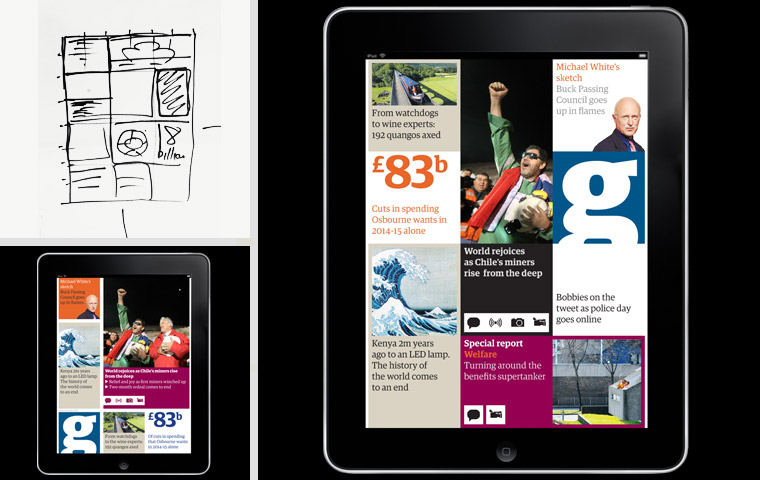
This is much fun, because you can prepare several breaking pages that consist of tiles filled with graphics or text which encourage the reader to read another article or to simply leap over several pages. A perfect example of that type of design is provided in The Guardian iPad app.

The Guardian’s famous grid. Source www.theguardian.com
And here is our own grid page that has been prepared based on the PressPad’s inDesige magazine templates.
After all the PDF behaves like this…

Even a slight change in design can be enough to meet digital readers’ expectations, and adding hyperlinks within the magazine is certainly one of the greatest, yet simple techniques to increase the value of a digital magazine. Firstly, it is how the user experience of the whole reading process can be taken to another level, and, secondly, this is a way for a publisher to drive readers to his social profiles or even advertisers’ websites.
This is important because according to eMarketer‘s “strong, steady growth in mobile advertising will push digital ads to represent nearly 30% of all US ad spending this year”, which means that publishers can effectively maintain their existing set of advertisers.

US Digital Ad spending, by Channel “(…)Advertisers will invest more than $50 billion in digital channels in 2014 for the first time, an increase of 17.7% over 2013. Just over one-third of that will come from mobile, but by 2018, mobile will account for more than 70% of digital ad spending.”
If you want to discuss your approach towards going mobile with your digital magazine get in touch with us. Call +1 888 712-0331 to discuss digital publishing needs for your magazine or start immediately risk free (pay only when your app is ready).


