Design of the magazine is a rather not a trivial process, but it can be fun. Actually, I am not going to use PowerPoint but something more elegant and available for free. I am talking about Google Slides, which is a part of the Google Docs suite. As a challenge, I will try to copy the design of one my favorite magazine’s couple of pages – Mighty Car Mods, published by PressPad. Read on to see the results of my work and the techniques I’ve been using.
About the magazine. Mighty Car Mods is an independent automotive series created by a couple of friends, Marty and Moog, who started filming videos on Marty’s mom’s driveway in 2007. They say they have come a long way since then, but they are still in the driveway with an unwavering focus on showing to their viewers the great car projects that they can do themselves at home. What is more, MCM publish their own digital magazine that is available on the PressPad platform.
The Magazine Design
If you take a look at all the issues of the Mighty Car Mods magazine you will see how their design has evolved, and to be honest, I really like the course it has taken.
So let us take two covers and two pages of different issues that I would like to try and copy using Google Docs. I will be using a few of the tools available in Google Slides, and these are:
- Text box
- Font picker
- Color pickers
- Crop Image
- Image Options
I work on Mac and that is why I will be using the Preview app to… perform simple operations on the images. Frankly, I am a big fan of using such simple, multi-purpose tools, and the Preview is one of them. Using Preview, I can crop parts of the image, extract whole shapes and add text and shapes.
Digital Magazine Cover Design
Google Slides have very useful supporting lines which are of help during the positioning of an element on a page. You will appreciate this feature especially during the design process of a magazine cover.
I took these original designs as a base and tried to replicate them into something similar. Here is what I have got. My intention was not to copy the whole cover verbatim, but rather use the same design principles.
So here we have the original cover (left side) design of the Mighty Car Mods magazine, issue 3.

It’s very slick, and clean. I really like the way the title box touches on the vehicle and I am going to replicate it in my Google Slides project.

Here is what I did. As you see, it is not exactly the same cover but it was not my intention to copy it. In Google Slides every single element of the project is a separate layer, which is very helpful during positioning. I can use CMD/ctrl + arrows for micro positioning.
Coming back to the Preview app, I have extracted the shape of my 1974 Lotus Europa (obviously a Matchbox model) and copy-pasted it onto the cover project in order to create contact with the title box.
The original image of the street has been taken from the Unsplash website and the “Lorem ipsum” quotes from the Cupcake Ipsum generator.
Takeaway:
- Use File > Page setup… > Custom to change your project orientation to portrait layout.

- Use CMD/ctrl + up/down to lift the foreground or drop to the background the particular layers (elements).
- If you want to create the shadows effect, you can create semi-translucent text boxes and stack them on top of each other (just like in the image below).

- Raising the contrast of the background image (click Image, then Image options… > Contrast) might be a good idea if you want to add some granularity to it.
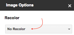
- Also, you can try to experiment with the Recolor option from the Image options

Recolor allows to recolor whole image according to several color themes.
Magazine Page Design
Perhaps one of the strongest design elements that distinguishes magazines from other publications is the use of columns and fancy-looking pages. Here are some of my selections, that I like in the MCM magazine. And these are the ones I am going to mimic in my Google Slides design.

As you can imagine, I am using simple Text box tool to create columns and rectangular shapes within them. It is super easy to paste the text inside such a grid. After all is done, I am making the borders invisible.

Takeaway:
You can use Word art in order to create some nice-looking elements on your page. For example, instead of looking for outline-type fonts you may chose any font and give it an inner color transparent, while outline color remains visible Menu > Insert > Word art.
Download PDF file that I created with all above examples. It is PDF export of the original Google Slides project.
Of course, it is possible to design an entire magazine using Google Slides. And you can still use hyperlinks inside the pages, both external and internal, linking to particular pages. That’s how you can design fabulous experience and interaction with your digital magazine overcoming the seeming obstacles of a PDF format.
Digital publishing solutions from PressPad
A flexible solution for PDF issues distribution, no obstacles.
Thinking about the digital solution for your magazine? Start with PressPad solutions.
Learn more about our digital publishing solutions »


