We did it! We have just published our own mobile magazine, in which we share our knowledge on digital publishing and content marketing ideas. We are a company that creates an easy-to-use digital publishing technology, and PressPad goes where Adobe is too corporate and Mag+ is too complicated.
We want the Digital Publishing Guide magazine to be a model publication, which will allow publishers all over the world to achieve even better business results by using the good practices presented below.
In this article, you will learn what techniques we have used to promote our magazine online and to increase its downloads from App Store and Google Play. We also have some statistics for those who are interested.
We assumed that the potential readers of our Digital Publishing Guide are only two steps away from checking out our mobile magazine.
- The first step is connected with overcoming the cognitive barrier and finding the magazine.
- The second step is connected with encouraging people to download the app to their mobile devices from App Store or Google Play.
Content Marketing Ideas
To overcome the first step:

1. We have created a Landing Page
A landing page is a topic-related page providing only the information about Digital Publishing Guide by PressPad. For that, we have used a simple and minimalist template which contains a clear description and visualization of the “product” in the form of a magazine cover. The magazine can be downloaded past the “share gate”. This means that the person who wants to download the magazine will have to either tweet the update with a previously made content or share it on Facebook. As a result, everyone who has downloaded the magazine automatically promotes it among their network of friends and followers. Moreover, topic-related pages are well positioned in the Google search engine.
Tips:
- We have used a free “Pay with a Tweet” gate.
- A landing page can be quickly created by using various creators or as an additional subpage of your blog.
- The information on the multiplatform character of the magazine is provided by means of graphic badges. This will allow iPhone, iPad and Android device users to know immediately that they are in the right place.
2. We redirect a part of the traffic
We have linked the magazine’s website on the selected pages in the PressPad ecosystem whose readers might be interested in Digital Publishing Guide. On the blog, you can see a banner (as well as below this article) with a clearly encouraging call to action “Get Our Free Magazine”. We have put a top bar with a link to Digital Publishing Guide in the visible spot at the top of the page with our free magazine templates.
Tips:
- In order to create banners, you can use free online editor Vinci.
- You don’t have to be a programming master to place a top information bar, just use Hellobar.
- you can use a free Buffer for queuing tweets and Facebook updates.
- in order to reach Twitter users, it might be a good idea to search for people who tweet on the topic relevant to the magazine (hint: check #hashtags for your community or topic).
- On Facebook, you can find topic-related groups by using the search engine, too. Simply copy that url into the address bar of your browser
https://www.facebook.com/search/more/?q=PUT_YOUR_KEYWORD_HERE - The magazine was made available online on Friday, 29 November 2013.
- The presented data was gathered from 29 November till 1 December (3 days).
- Landing page with Digital Publishing Guide has been visited 353 times (unique users)
- and has received 85 Tweets + 22 Likes mostly from people who downloaded our magazine
- Digital Publishing Magazine App has been downloaded 153 times (iOS: 97%) which gives awesome conversion rate of 43%
- 50% of downloads came from USA
3. We promote ourselves in Social Media
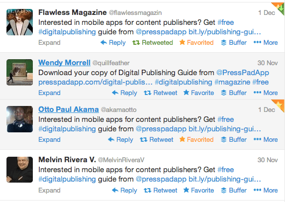
We link Digital Publishing Guide in all the Social Media channels we use. On Twitter, we tweet every few hours and encourage people to download the magazine.
By doing so, we somewhat “pump” the network with the information about Digital Publishing Guide. The role of our own network of friends is invaluable, because it is them who, at the initial stage of promotion, are the first ones to forward the information about the magazine, and they were also certainly one of the first people to have reviewed Digital Publishing Guide by PressPad.
Tips:
To overcome the second step:

4. An attractive magazine preview
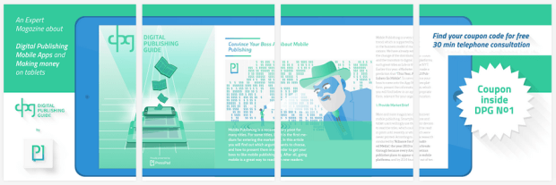
We have created an attractive preview in the form of a whole “cut” into elements for everyone who ends up on the shop’s website. In order to be able to read the whole thing, you have to see all the elements. I think it’s a great way for drawing the user’s attention to the last piece of the puzzle, which is the promise to receive a coupon. In the last image of the preview, the user is informed that inside the magazine, there’s a coupon with a password, which entitles them to arrange a 30-minute phone consultation. This is something that should certainly encourage all the undecided to download the magazine to their device.
5. An app name and description which explain a lot
The name in itself is informative. We have decided not to use abbreviations (DPG) and specialized vocabulary. The “Digital Publishing Guide” name in itself explains a lot, and a short description of the application is somewhat an extension of the name, see for yourselves:
“Digital Publishing Guide is a quarterly published magazine about publishing on tablets and smartphones, delivered to you by PressPad team. The magazine offers a free subscription.”

